# 用 VuePress 製作說明文件頁面 — 5:改樣式、加元件
## 本篇大綱
* [本篇要解決的問題](https://www.letswrite.tw/vuepress-document-style-component/#%e6%9c%ac%e7%af%87%e8%a6%81%e8%a7%a3%e6%b1%ba%e7%9a%84%e5%95%8f%e9%a1%8c)
* [修改樣式 Styling](https://www.letswrite.tw/vuepress-document-style-component/#%e4%bf%ae%e6%94%b9%e6%a8%a3%e5%bc%8f-styling)
[palette.styl](https://www.letswrite.tw/vuepress-document-style-component/#palettestyl)
* [使用元件 Using Components](https://www.letswrite.tw/vuepress-document-style-component/#%e4%bd%bf%e7%94%a8%e5%85%83%e4%bb%b6-using-components)
[安裝預處理器](https://www.letswrite.tw/vuepress-document-style-component/#%e5%ae%89%e8%a3%9d%e9%a0%90%e8%99%95%e7%90%86%e5%99%a8)
[建立按鈕元件](https://www.letswrite.tw/vuepress-document-style-component/#%e5%bb%ba%e7%ab%8b%e6%8c%89%e9%88%95%e5%85%83%e4%bb%b6)
* [原始碼、Demo](https://www.letswrite.tw/vuepress-document-style-component/#%e5%8e%9f%e5%a7%8b%e7%a2%bc%e3%80%81demo)
* [用 VuePress 製作說明文件頁面系列](https://www.letswrite.tw/vuepress-document-style-component/#%e7%94%a8-vuepress-%e8%a3%bd%e4%bd%9c%e8%aa%aa%e6%98%8e%e6%96%87%e4%bb%b6%e9%a0%81%e9%9d%a2%e7%b3%bb%e5%88%97)
---
## 本篇要解決的問題
在上一篇〈[用 VuePress 製作說明文件頁面 — 4:佈景主題、外掛](https://www.letswrite.tw/vuepress-document-theme-plugin/)〉我們改變了整個 VuePress 的佈景主題,也加了一些外掛,可以丟給同事看說「這我 10 分鐘內做出來的」嚇嚇他們。
不過,雖然背景主題好用,但有時我們不想要改整個主題,只是想要修一些頁面上的樣式,比方改個文字的顏色、加個按鈕……什麼的。
如果是加按鈕,那可以包成一個元件(Component),這樣當未來按鈕想要修改時,只需要改 Component 的檔案就可以統一改好整個站的按鈕,而不用一頁一頁打開的去改。
本篇主要會示範怎麼樣修改 VuePress 的 CSS,以及怎麼樣加上 components。
---
## 修改樣式 Styling
修改樣式的說明文件:[英文](https://vuepress.vuejs.org/config/#styling) | [簡中](https://vuepress.vuejs.org/zh/config/#styling)。
VuePress 用的是 Stylus,雖然 Augustus 也沒用過,但似乎跟 Sass 沒差很多,因此用起來還算順手。
文件上說明,樣式的檔案 VuePress 會自動抓 2 個,分別是管理變數的 palette.styl,跟寫自訂樣式的 index.styl。
在 .vuepress 的資料夾底下先新增一個名為「styles」的資料夾,接著在 styles 裡面建 2 個檔案:palette.styl、index.styl。
### palette.styl
`.vuepress/styles/palette.styl` 這個檔案主要是拿來修改變數的,預設可以改的變數有以下:
```
// colors
$accentColor = #3eaf7c
$textColor = #2c3e50
$borderColor = #eaecef
$codeBgColor = #282c34
$arrowBgColor = #ccc
$badgeTipColor = #42b983
$badgeWarningColor = darken(#ffe564, 35%)
$badgeErrorColor = #DA5961
// layout
$navbarHeight = 3.6rem
$sidebarWidth = 20rem
$contentWidth = 740px
$homePageWidth = 960px
// responsive breakpoints
$MQNarrow = 959px
$MQMobile = 719px
$MQMobileNarrow = 419px
```
比如我們想要改變所有連結的顏色,預設是 `$accentColor = #3eaf7c` 這個,是 Vue 的綠色,我們想改成藍色的話就在 palette.styl 上寫:
```
$accentColor = #42A6F7
```
鏘鏘~我們的超連結顏色就換成藍色啦:
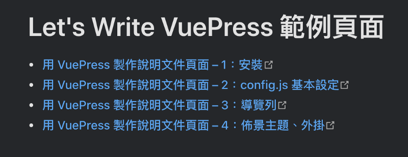
連結顏色改為藍色
在改變數這邊要注意一個點,就是如果我們有額外安裝佈景主題的話,注意看文件上有沒有設定其他變數?
比如我們前一篇安裝的深色佈景,裡面就寫說改變顏色的變數是 `$accentDarkColor`,如果只改了 `$accentColor` 會發現頁面沒反應。
### index.styl
除了設定變數以外,想加其它的 CSS 就寫在 index.styl 裡。
比方我們想要設定 .btn 這個 class,那就在 `.vuepress/styles/index.styl` 這個檔案中加上:
```
.btn
display inline-block
padding: .5rem 1rem
line-height 1.5
background-color: $accentColor
border-radius: .25rem
color: #FFF
&:hover
background-color: #167FFF
text-decoration: none !important
```
之後就可以在各個頁面使用囉。
Markdown 的檔案可以寫 HTML,我們寫上:
```
Let's Write 官網
```
開啟頁面後就看得到按鈕啦:
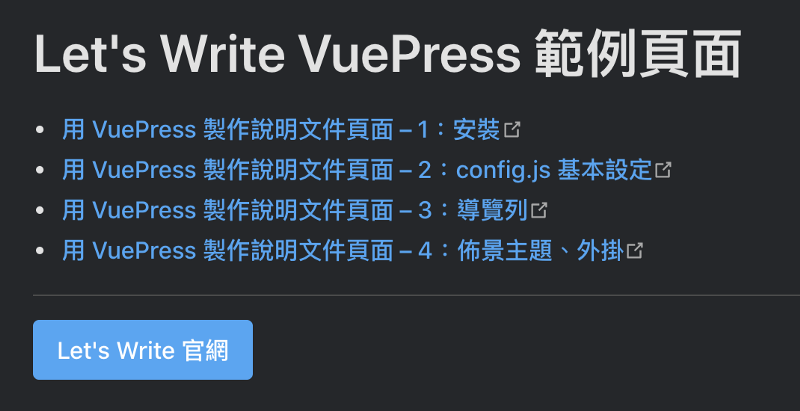
加入客製樣式的按鈕
---
## 使用元件 Using Components
在 VuePress 上 Component 的檔案內容跟我們在 Vue CLI 上很像,不一樣的是當我們建好一個 \*.vue 的檔案後,不必另外寫 `import` 就可以在所有頁面上使用。
所有 components 的檔案被規定要放在 `.vuepress/components/` 的資料夾中,以下就來建立一個按鈕的 component。
### 安裝預處理器
在開始寫 component 之前,因為 Augustus 習慣寫 Pug,因此要先來安裝讓 VuePress 可以讀取 Pug 的 loader。
文件:[英文](https://vuepress.vuejs.org/guide/using-vue.html#using-pre-processors) | [簡中](https://vuepress.vuejs.org/zh/guide/using-vue.html#%E4%BD%BF%E7%94%A8%E9%A2%84%E5%A4%84%E7%90%86%E5%99%A8)。
文件上有說明,VuePress 已經對 sass、scss、less、stylus、pug,這幾個寫好了在 webpack 上的配置,因此我們只需要安裝好就行。
stylus 不必安裝什麼就可以直接使用,下面的 component 上會直接用 stylus。
要能使用 Pug 的話,打開終端機進到資料夾後,輸入:
```
yarn add -D pug pug-plain-loader
```
安裝完畢就可以直接使用了。
### 建立按鈕元件
.vuepress 中新增名為「components」的資料夾,接著新增一個檔案,取名為「Btn.vue」。
檔名很重要,當我們取為 Btn 時,之後在各頁面要使用這個 component 就是寫:
```
```
就會引用好這個 component。
我們在 Btn.vue 的檔案中寫入以下:
`lang="pug"` 是指 `template` 是用 `pug` 來寫,如果沒有事先安裝好上面那段的預處理器就會報錯,要使用 Pug 的話記得先安裝。
因為每個按鈕的文字、連結有所不同,因此用了 2 個 props:`title`、`uri`。
`lang="stylus"` 是指 `style` 會用 `stylus` 來寫,我們這邊就簡單寫個樣式上去。
要使用這個按鈕的 component,就在要放按鈕的 \*.md 檔上寫像這樣:
```
```
就會成功看到按鈕出現囉~
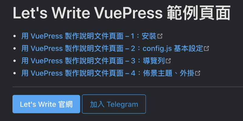
加入按鈕 component
像這樣把按鈕用成 component 的好處是,假如有一天我們要改按鈕,比方要把 `target="_blank"` 給刪掉,那我們只需要修改 `.vuepress/components/Btn.vue` 裡的程式碼就好,所有引用到按鈕的頁面就會同步一起更新,省去了我們一頁一頁打開頁面去檢查的時間。
---
## 原始碼、Demo
本篇開始,原始碼跟 Demo 都會放在 GitHub 上,歡迎取用。
Demo 會隨著系列文更新,所以看到的程式碼會逐漸豐富。
取用之前可以先對本篇點個讚或分享~
原始碼:
Demo:
---
## 用 VuePress 製作說明文件頁面系列
1. [安裝](https://www.letswrite.tw/vuepress-document-setup/)
2. [config.js 基本設定](https://www.letswrite.tw/vuepress-document-basic/)
3. [導覽列](https://www.letswrite.tw/vuepress-document-nav/)
4. [佈景主題、外掛](https://www.letswrite.tw/vuepress-document-theme-plugin/)
5. [改樣式、加元件](https://www.letswrite.tw/vuepress-document-style-component/)
6. [部署](https://www.letswrite.tw/vuepress-document-deploy/)